I get a lot of comments about the HESTIBELL® logo and many people say that they like it so much. The Logo is like a “painting” in that everyone sees something in it for themselves. I am often ask how the Logo was created and what it means … so I want to share it’s background with you.
If you have not seen the Logo before here are our two standard layouts.

The Brand
The HESTIBELL® Brand is built around my name … which is Hesti Bell and yes it is my real name. It is also built around my story.
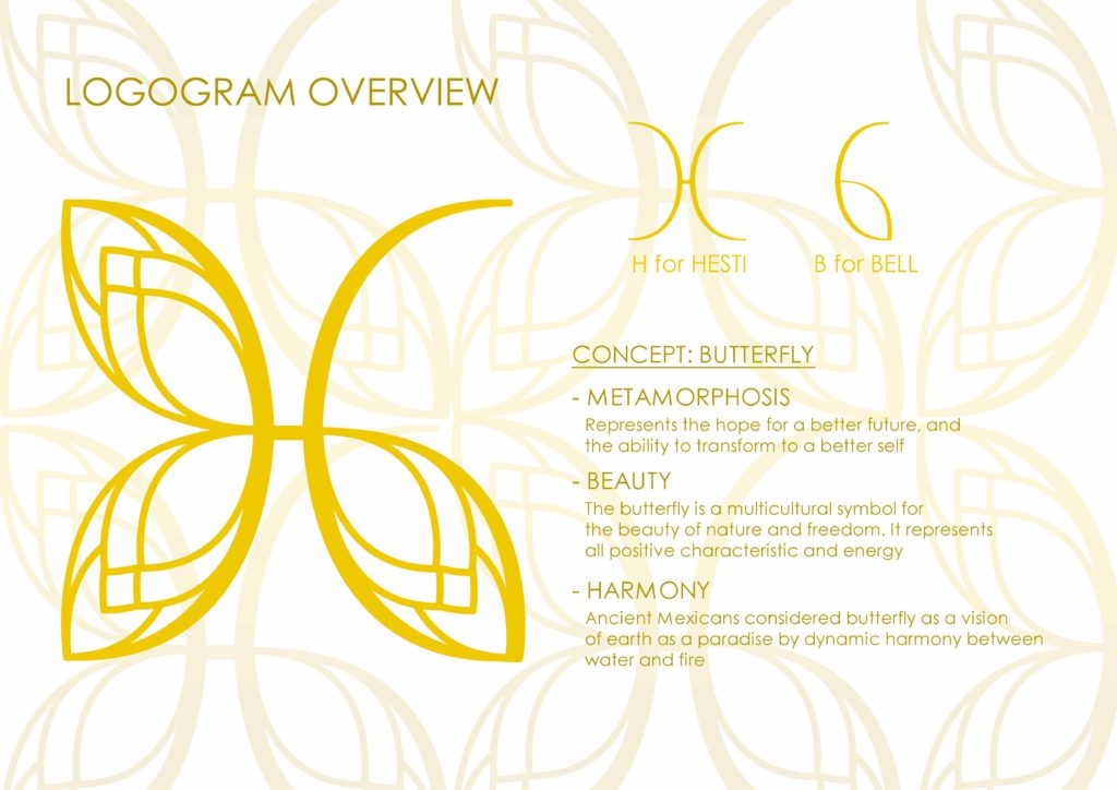
I am lucky in that I have an amazing creative people in my Marketing Team. Below is part of the Logogram that they gave me so you can see how the original concept was presented to me.

The Colour
The colour is Gold: A precious metal … it is luxurious, it is trusted for it’s value over time … it is a reflection of HESTIBELL®.
The Font
The Font is Century Gothic, sans serif in upper case: For a dynamic, modern and fun feel. And to make it easier to read HESTI is bolded.. so it is HESTIBELL.

The Logo Graphic
The Concept is: Butterfly
It is about Metamorphosis: It represents the hope for a better future and the ability to transform to a better self.
It is about Beauty: The butterfly is a multicultural symbol for the beauty of nature and freedom. It represents all positive characteristics and energy
It is about Harmony: Ancient Mexicans considered the butterfly as a vision of earth as a paradise of dynamic harmony between water and fire

The Butterfly Building Blocks
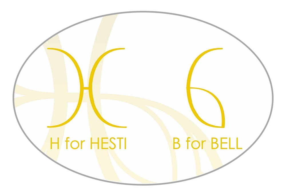
The building blocks for the Butterfly come from my name: H for Hesti and B for Bell.
The Butterfly and Me
Butterflies are really my inspiration. I come from a life where I was only ever a caterpillar and I though that was my destiny. Then, as fortunate would have it, some people came into my life and showed me that I could transform myself and become a Butterfly. Read a little more in About Hesti. It is really just a summary and one day I will tell the whole story. For now just know that I created HESTIBELL® so everyone can become a Butterfly!
